THOMAS EVANS | DATE 8/25/2011
Siglio is an independent press in Los Angeles dedicated to publishing uncommon books that live at the intersection of art and literature. Founded in 2008 by Lisa Pearson, Siglio cultivates wider audiences for original, provocative work, whether by renowned, forgotten, or unknown artists and writers. This interview was begun in March 2011 and is published here in two parts.
ARTBOOK: Hi Lisa, thank you for agreeing to this interview, especially in the midst of shepherding your two spring 2011 titles into the world (It Is Almost That and Book of Ruth) and your appearance at the Artbook/Paperchase/Big City Forum panel Making a Case for the Book in the Digital Age (Wednesday, March 2 2011). Before we talk about Siglio, let me use the occasion of the panel to ask you to recall your earliest attraction to books as made objects--whether as a child, or student, or later. You've situated Siglio explicitly in the rich overlap between image and text, which suggests some formative encounters in children's literature…?
LISA: Thanks so much for asking. It’s a nice respite from all that I have to do! So, my first reaction to your question was no, not children’s literature but encyclopedias, dictionaries, books of collections of certain kinds. Immediately, one book came to mind: Forrers Reallexicon. When I was twenty or so and backpacking through Eastern Europe, I found this fantastic (and enormous) volume from 1907 in Budapest, an illustrated compendium written in German of ancient history—Neolithic, Greek, Egyptian, Assyrian all the way up to early Christianity. The illustrations reproduced artworks, hieroglyphs, finds at particular archeological sites, taxonomies of stone axes, mosaic designs, pottery shards, hairstyles on Roman busts, etc. I lugged this seven-pound book around for more than a month out of pure love for the book as an object. It made complete sense to me at the time. There was no jettisoning it, despite the fact that I couldn’t read a word of it.
But then, as I was writing this answer this morning, I looked up to see the twelve volume set of
My Book House by Olive Beaupré Miller on an upper shelf in my office. This is a collection of collections—of stories, poems, pictures—organized by themes like “Over the Hills,” “Flying Sails,” and “Through Fairy Halls.” Originally published in the twenties, they have those Deco-infused illustrations that interrupt the text in quite dynamic ways. As a child, I loved them because the pictures were beautiful and I could dwell on them, but they never seemed to replace the images the text conjured in my imagination. Each volume seemed inexhaustible, and they had a real physical presence throughout my childhood: both I and my dog ate them up (#2 “Story Time” has a thoroughly gnawed corner). Now I love them because they are beautiful—the row of spines is a gradient of color from meadow green to lapis blue (though the contents, often quite colonial in tone, are wince-inducing) and they remind me that every book I make is meant to be devoured.
ARTBOOK: Forrers Reallexicon looks very inspiring (in the googlebook preview edition, which sadly omits most of the illustrations you mention)--and enormous indeed, at nearly 700 pages. A title like My Book House--also available again through a print-on-demand publisher!--sounds almost calculated to subliminally induce children to start up their own imprint. Whether that would be a literary or art imprint is another question, one that you’ve obviated with Siglio by choosing both--a very edible combo dish, if “combo” is the right word, since there have been periods when no generic distinction existed between art and literature, which were intertwined in the service of a larger conception--as with manuscript painting, for example. Did you encounter the artists and writers you’ve published all at once, or did one lead to the other, or both? And what were you doing prior to founding Siglio?LISA: I agree, the art-literature divide seems very artificial and, as you pointed out, strangely recent. I am glad though you mentioned illuminated manuscripts. There’s a Rogier van der Weyden painting of Mary Magdalen sitting on the wood floor in her green dress, enraptured in the private world of her little book while others (seen only up to the thigh) mill about. Her experience of reading seems immersive, contemplative, and complete. Illuminated manuscripts, for me, are the ur-texts for Siglio. They show me how immense the potential of the physical space of the book and the page, of the complexity of relationships between image and text.
The nature of “Siglio” is its interdisciplinariness, its insistence on making unexpected connections, its eclecticism and resistance to categorization, so there is certainly no context in which I would’ve discovered all of these artists and writers at once (and of course there are so many artists and writers I’m interested in, that have influenced the press in some way, that I haven’t published). What I have is a kind of mindset that I was fortunate enough to have had nurtured early by a really outstanding teacher in high school. Recognizing my contrariness and curiosity, he created opportunities for me to understand how to make leaps that are unconfined by the literal, how to see various kinds of convergences and divergences. When I was involved in a school production of
Midsummer Night’s Dream, he gave me a copy of Peter Handke’s
Offending the Audience. While I was deep into the Beatles, he had me listen to Phillip Glass. Perhaps what he taught me most was how to truly immerse myself in a work and to pay little attention to those kinds of artificial distinctions you mentioned earlier. And more than anything, he just gave me a lot to read, look at, and listen to that I was lucky to encounter at such an impressionable age.
That’s probably why I ended up on that backpacking trip to Eastern Europe. I wanted to see Prague (because I loved Kafka first, Kundera second), the Bukovina monasteries in Romania, and then land in Berlin because I loved Dada, Brecht, cabaret and had a nascent fascination with both the Weimar Republic and with the Cold War. I lived in Berlin for a few years, and I did study while there (I know you’re going to ask: Comparative Religion with an emphasis on History) but really my education was in the museums and theaters, the squatted and appropriated spaces (in the West and East, respectively--the wall was still up), in the city library (when I see it in Wender’s
Wings of Desire, I swoon; I loved that library!), and in being irrevocably an outsider. In all cases, I just followed one thing to another, wherever it led, across whatever boundaries. And that’s how I do things at Siglio.
And for clarity’s sake, prior to founding Siglio, I finished my undergrad and grad degrees, worked in non-profit arts (theaters mostly, but also film running a festival, outreach and grant programs), taught (creative writing, comp, English as a Second Language), and wrote short fiction. But the common denominators through all of it are books and art and language.
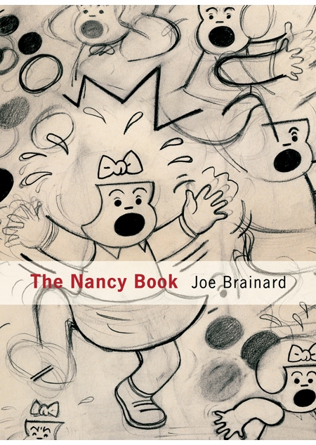
ARTBOOK: I’ll reluctantly forgo a digression on the topic of Romanian monasteries and ask you instead about starting up Siglio. The press made a splash with its debut publication, Joe Brainard’s The Nancy Book (2008), with lots of reviews and press. How did the book come to be Siglio’s first book, and how did it come about? LISA: I’ll stay focused! No Romania. (Too bad!)
I started the press by writing to individual artists and writers whose work I deeply admired, whose work influenced my editorial vision for the press in some way, and/or who had a particular work I imagined other publishers would find unwieldy, “unpublishable” even. Each of those letters took hours (days, even!), and they jumpstarted a number of projects.
The Nancy Book was simply first out of the gate. There was absolutely no strategy here, only serendipity.
After I wrote to him, Ron Padgett--who makes all of the creative, editorial decisions for Joe Brainard’s estate--met me in the middle of March at this tiny, windowless restaurant at the back of the Lithuanian Cultural Center on the Lower East Side. We were the only ones there, and we just hashed out the book over coffee. Six and a half months later
The Nancy Book was on press and released just over a year from that initial meeting. There were other possibilities for a Brainard book certainly, but we both really liked putting together a book that Brainard himself had already given a title too (there were two “Nancy” books--one collaboration with Ron from Ted Berrigan’s
C Comics; the other a suite of twenty “If Nancy” drawings that included more well-known pieces like “If Nancy Was an Ashtray,” and “If Nancy Was a Boy”). It was also important to both of us that the book contain a lot of unknown and unpublished works, and we thought that--though “Nancy” was only one of many facets of Brainard’s work--this would attract new audiences to his work.
So, I’m not sure
The Nancy Book was a “splash” but people really do love this book. And that people’s first association with Siglio was through Brainard was very potent. Brainard was a part of one the richest collaborative communities in twentieth-century America, the New York School, and particularly Brainard’s generation was fueled by real and enduring conversations across art and literature. Brainard’s own work is rich with play, a sense of joy and wonder, but it is also incisive with an extraordinary visual sophistication. And it’s utterly unpretentious (and obsessive, which I love). And finally, his work is not nearly as widely known and appreciated as it should be. All of these things set excellent precedents for what might follow in future Siglio titles. Behind the scenes, too, I got an excellent start. The love and goodwill surrounding Brainard just rubbed off: people were unbelievably kind and willing to help. But my luck was greatest in getting to work with Ron on the first book. He was very generous in teaching me things that I would’ve learned through much, much harder lessons any other way.
ARTBOOK: That’s a lovely tale. Did other Siglio books come from this first round of letters?LISA:
Torture of Women by Nancy Spero did, and I’ve got two projects in the works--one likely to come out next year--that also originate in these letters. I also wrote to Louise Bourgeois then too, and while that didn’t result as book, she gave me permission to publish “He Disappeared Into Complete Silence,” which is a cornerstone piece in
It Is Almost That, the image+text collection of work by women that’s out this May.
ARTBOOK: You’ve just posted a great essay on your new Siglio blog, in which you cite an early samizdat copy of Milan Kundera’s The Unbearable Lightness of Being that was circulating prior to its ‘official’ publication (and which I imagine you encountered on your aforementioned trip to Prague?) as “something of a totem for Siglio.” You describe it as “an act of resistance to the literal, the authoritarian and the facile, as the result of undeterred ambition to share a work of art that might otherwise remain unseen and unread, and as a testament to the ‘book’ as refuge, dissent, beacon, and nexus.” Siglio’s publication of Torture of Women seems like a great example of this stance, and a beautiful production to boot.LISA: (Just a quick clarification:
The Unbearable Lightness of Being was published--just not in Czechoslovakia--first in France in 1984 and then widely translated. The samizdat copy I read--yes, on my first trip to Prague in 1988--was in English. I don’t know if there was a copy being passed around in Czech, but from conversations with friends, it seemed as if censored literature was often read in foreign languages.)
So Siglio’s “translation” of Spero’s
Torture of Women to book form absolutely has that in mind. Spero’s own work certainly embodies acts of resistance. As an early feminist artist who worked in relative obscurity until her 50s, Spero persisted when the dominant culture refused to listen or to look. While
Torture of Women definitely transcends its time, we live in a culture that, thirty years later—as torture, human rights abuses, and gross injustices are being debated—makes this work persistently topical.
For those who don’t know
Torture of Women, it’s an epic piece, composed of 14 panels totaling 125 feet, that juxtaposes bulletin-typed and block-printed testimony by victims of torture, news reportage, and ancient creation myths with quite startling imagery drawn from Egyptian, Sumerian, and Babylonian art without making torture visually explicit. And I’ll take a moment here to stress that Siglio’s publication is a “translation” because this is a work that has a kind of impact in space that can’t be replicated on the page--which is why so much of Spero’s work is so hard to reproduce effectively. (Here is another small act of resistance: imagine a book that does an artist’s vision justice by creating a parallel work rather than collecting images which simply document the fact of the work’s existence.) The question here was: what can the book do that the exhibition space can’t? And the answer is that the book can provide time, a shift from looking to
looking and reading. Here is complex, multi-layered narrative (of words and images) that deserves to be truly
read, a kind of engagement virtually impossible in an exhibition space. We collaborated with Nancy to reproduce the piece (with shifts in scale, repetition, various framing/cropping, etc.) so that it could have another life on the page—and a wider audience. (And there is an interview with the designer on the BOMBlog that goes into detail about the process of translation/designing.)
But I also say in this essay that Siglio is not a political press. I am interested in many
different kinds of acts of resistance and subversion, in the book as refuge
and beacon
and nexus (in addition to dissent). And this manifests in what I choose to publish and how I publish it.
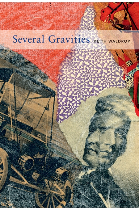
ARTBOOK: That’s clear from the two other Siglio titles that were published prior to your joining Artbook | D.A.P. in Spring 2011: Keith Waldrop’s Several Gravities (2009) and Danielle Dutton’s S P R A W L (2010). Several Gravities, which appeared as Waldrop won the National Book Award, consolidates what seems to be the preferred Siglio touch: the book as unified composition, in this instance combining prose, poetry and collage, in such a way that each element feels page-specific, spread-specific, sequence-specific and therefore book-specific. In other words, you don’t make catalogues, nor do you drop content into a given format.LISA: These are Siglio’s intentions exactly.
Several Gravities conjured a very particular space which critics always mentioned, likening it to a tiny museum or musical counterpoint. The book was edited by the late Robert Seydel (author also of this year’s
Book of Ruth), who paid extraordinary attention to the selection and sequence, giving the reader a much richer, multi-faceted experience with “collage” (whether formal, sensual, philosophical) and creating a very intentional composition that made room for the ambiguities in Waldrop’s work to breathe. The design is the underpinning: an intimate book in which there is a musicality, a movement as if walking or wandering, and in which each collage (whether visual or textual) yields more with a lingering read.
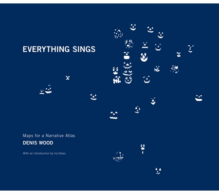
Everything Sings: Maps for a Narrative Atlas by Denis Wood also depends very much on its design to create a quite different but no less intentional space. The author is a radical geographer whose heretical critique of the subjectivity of maps in the 80s and 90s is now widely influential. This early, personal project has a quasi-cult status among the cartography and geography community but also among listeners of
This American Life which produced a segment on mapping that included an incredulous and amazed Ira Glass interviewing Denis whose desire to map anything and everything seemed indefagitable. (It’s the interview that led me to contact him.).
Everything Sings collects Denis’s maps of the “unmapped” and the “unmappable” in his 1/2 square mile neighborhood in Raleigh, North Carolina. The book includes 50 or so maps (of radio waves, Halloween pumpkins on porches, neighborhood newsletter mentions, the paper boy’s route in space and time, etc.) that are visually elegant as well as rife with social commentary and critique. Wood is invested on multiple fronts: in the novelistic potential in the form of the “atlas,” in the poetic resonance of maps themselves, in the resistance to maps conveying a single, static truth, but also in his own subjective arguments about the relationships between social class and cultural ritual, and in the neighborhood functioning as a kind of “transformer.”
Our challenge was to make a book in which all of these various layers can be read separately and/or simultaneously. Moreover, it had to reflect the very appealing combination of Denis’s joyful sense of subversion and his scientific rigor. And I think we accomplished that. Denis and I sequenced the book together, paying attention not only to how the “narrative” was structured but also to the visual rhythm (with delight and seriousness in mind, juxtaposing for visual impact, accumulating for seeing certain kinds of mutations). Crucial to that success was also giving each map its own distinct visual presence for the reader to contemplate within the context of the information given—or without it (as each map has multiple resonances); using a certain uniformity (that mimics elements of a conventional atlas) while also subtly interrupting or shifting it; and stripping the design down, a strategy that parallels Denis’s own insistence on removing the “map crap”--scale, orientation, street grids. The book feels like an atlas at the same time it is clearly playing with our notion of what an atlas is.
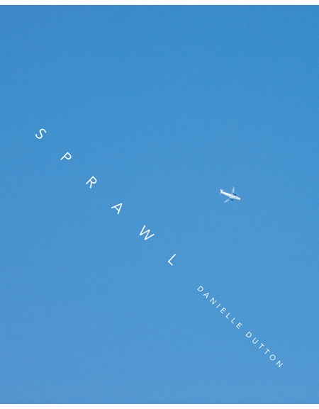
ARTBOOK: Simply for its absence of visual materials, Danielle Dutton’s S P R A W L might seem to some an anomaly in your list to date. It’s full of visual character, however, from its playful cover to its spacious typesetting, to the image vividness of the writing itself.LISA: This novel was an unsolicited submission, and I knew from the start that it was a perfect Siglio title. I’ve been wanting to publish a lot more prose and fiction that has a kind of visual inflection--either with actual visual elements (e.g. W.G. Sebald, Alisdair Gray, Theresa Hak Kyung Cha) or by engaging the visual arts in another, less literal way.
S P R A W L belongs to the latter category. Danielle began writing the book, using a series of domestic still lifes by the photographer Laura Letinsky as departure points. She also wrote texts that extended from appropriated words and phrases by authors as varied as Thoreau, Perec, Stein, Cheever and Brönte, and from works as diverse “Anarchism is Not Enough,” “The Encyclopedia of Cake Decorating,” and “Lawns as Artifacts.” Then she wove the short works together into a single paragraph that spans 144 pages. The text literally sprawls. In her own description of the novel when she first approached Siglio, Danielle talked about how she wanted the surface to convey an unrelenting sameness, but once the reader was inside it, the sentences would have different qualities (rough, smooth, dull, shiny), calling attention to
illusion of uniformity. She was clearly thinking of the novel--and the language it uses--in dimensional terms, something writers of prose seem to rarely consider.
Now all of this may sound quite formal, and I certainly find that interesting. But I published
S P R A W L because Danielle uses these means to an extraordinary end. Her novel is a very funny, deeply affecting chronicle of the mercurial inner life of one suburban woman. It is also an unusual and multi-faceted lens through which she reveals the enthralling strangeness of the world in which we live. And Danielle is the real thing as a writer. She is acrobatic. There is so much pleasure in reading her work.
But back to your original observation. Why isn’t
S P R A W L an anomaly? Because it’s composed of a single paragraph,
S P R A W L demanded particularly keen attention to the book as an object and the page as frame. First, there is simply the question of keeping a reader’s eye engaged over 144 pages without the visual pause of paragraph breaks. Therefore, we put a lot of space in the margins and between the lines. But this also works on a metaphorical level too: here is the emptiness upon which the text is always, relentlessly encroaching--or filling. The cover design conveys the perspective of a person looking up at plane flying through the unending blue of the sky above—one might imagine--the sprawl itself. That inherent gesture and its potent suggestion were very appealing (and we extended the sky on to front and back flaps). Early on, we did discuss approaching Laura Letinsky to possibly incorporate her images in the book--as a portfolio, on the cover or inside cover, as a single frontispiece. But those ideas were rejected quickly. The photographs are already in the book as Danielle has “rendered” them into text (she “catalogues” them, creating strange and beautiful taxonomies); thus, in a way, reproducing the images would have been redundant. It would’ve also constrained the reader into looking for a correlative relationship between image and text, undermining the richness of this novel and the many ways in which it can be read.


