| RECENT POSTS DATE 12/11/2025 DATE 12/8/2025 DATE 12/3/2025 DATE 11/30/2025 DATE 11/27/2025 DATE 11/24/2025 DATE 11/22/2025 DATE 11/20/2025 DATE 11/18/2025 DATE 11/17/2025 DATE 11/15/2025 DATE 11/15/2025 DATE 11/14/2025
| | | THOMAS EVANS | DATE 10/13/2011ARTBOOK: As we conduct this interview, titles youd announced at its outset (back in March) have come off press. Robert Seydels Book of Ruth was released in May--sadly after his tragic death at the age of 50, in January of this year. Youve already referred to the scrupulous editorial attention Seydel brought to Keith Waldrops Several Gravities, and Book of Ruth again fulfills the Siglio credo in terms of its abundant completeness as a book work unifying visual and linguistic materials. Perhaps you could give us some contextualizing sense of Seydels works and life, as the book makes its way into the world?LISA: Robert lived in Amherst, Massachusetts literally around the corner from the Emily Dickinson house. Like her (whom he revered), he was reclusive and his time was spent reading and working, both as natural and necessary to sustaining him as breathing. His three-room apartment was on the first floor of an old house and it was brimming with thousands upon thousands of books. His shelves had rows of books two deep--pull out a book and there was another behind it, and there were stacks of books everywhere--on top of the fridge, next to the stove, in the closet, on every available surface. In his notebooks, he made lists of the books he was reading--twenty, thirty, forty at a time. These lists are the most amazing, surprising constellations of authors and subjects ranging from prehistoric rock art to New York School poetry, from William Blake to Fluxus. Roberts intellect and imagination could make fantastic leapslike his beloved Hare, the totem for Ruth Greisman, his alter-ego and author of the works in Book of Ruth. (One of these lists along with photos of his library are on the Siglio blog.)Anti-careerist, completely uncompromising, Robert was that very rare creative individual whose visual and literary talents were abundant in equal measure. I can think of no other visual artist who understands language and the literary as Robert did and who intertwined image and text with as much subtlety, agility, and playfulness. And while he did not like to call himself a writer, he was a Writer. The few dozen diary entries in Book of Ruth accomplish what some novelists can barely do in a hundred pages in their evocation of an interior life. Theres a longer essay
I wrote on Book of Ruth thats posted on the Siglio website that really delves into the nature of his work, but if I had to sum up Roberts particular gifts, I would have to point to the ways in which he transforms the everyday, the discarded, the detritus into something that reorients ones sense of being in the world and being of the world. Theres also an interview that Savina Velkova conducted with him last fall before he died that probes his influences as well as the very complex layers of persona and gender in Book of Ruth.Robert left behind a prolific and deeply accomplished body of literary/visual work. Ruth was one of many personas and Book of Ruth collects just a sliver of that series. It is devastating to imagine what else he might have accomplished had his life been longer.ARTBOOK: Thank you for that nice portrait, and those interested in learning more about Seydel should look at this great interview in the Siglio online library.
ARTBOOK: As we conduct this interview, titles youd announced at its outset (back in March) have come off press. Robert Seydels Book of Ruth was released in May--sadly after his tragic death at the age of 50, in January of this year. Youve already referred to the scrupulous editorial attention Seydel brought to Keith Waldrops Several Gravities, and Book of Ruth again fulfills the Siglio credo in terms of its abundant completeness as a book work unifying visual and linguistic materials. Perhaps you could give us some contextualizing sense of Seydels works and life, as the book makes its way into the world?LISA: Robert lived in Amherst, Massachusetts literally around the corner from the Emily Dickinson house. Like her (whom he revered), he was reclusive and his time was spent reading and working, both as natural and necessary to sustaining him as breathing. His three-room apartment was on the first floor of an old house and it was brimming with thousands upon thousands of books. His shelves had rows of books two deep--pull out a book and there was another behind it, and there were stacks of books everywhere--on top of the fridge, next to the stove, in the closet, on every available surface. In his notebooks, he made lists of the books he was reading--twenty, thirty, forty at a time. These lists are the most amazing, surprising constellations of authors and subjects ranging from prehistoric rock art to New York School poetry, from William Blake to Fluxus. Roberts intellect and imagination could make fantastic leapslike his beloved Hare, the totem for Ruth Greisman, his alter-ego and author of the works in Book of Ruth. (One of these lists along with photos of his library are on the Siglio blog.)Anti-careerist, completely uncompromising, Robert was that very rare creative individual whose visual and literary talents were abundant in equal measure. I can think of no other visual artist who understands language and the literary as Robert did and who intertwined image and text with as much subtlety, agility, and playfulness. And while he did not like to call himself a writer, he was a Writer. The few dozen diary entries in Book of Ruth accomplish what some novelists can barely do in a hundred pages in their evocation of an interior life. Theres a longer essay
I wrote on Book of Ruth thats posted on the Siglio website that really delves into the nature of his work, but if I had to sum up Roberts particular gifts, I would have to point to the ways in which he transforms the everyday, the discarded, the detritus into something that reorients ones sense of being in the world and being of the world. Theres also an interview that Savina Velkova conducted with him last fall before he died that probes his influences as well as the very complex layers of persona and gender in Book of Ruth.Robert left behind a prolific and deeply accomplished body of literary/visual work. Ruth was one of many personas and Book of Ruth collects just a sliver of that series. It is devastating to imagine what else he might have accomplished had his life been longer.ARTBOOK: Thank you for that nice portrait, and those interested in learning more about Seydel should look at this great interview in the Siglio online library.

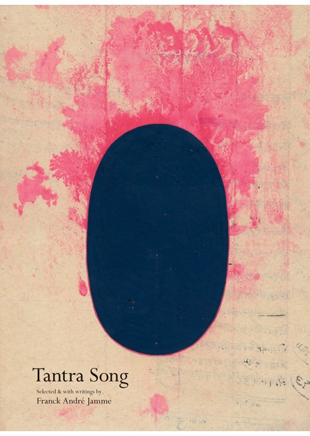
ARTBOOK: As of October, the latest Siglio publication is Frank André Jammes Tantra Song, a collection of very beautiful contemporary Tantric paintings from Rajasthan. In fact the collection is Jammes own, built up over decades worth of visits to Rajasthan, and it consists of works that will certainly expand and amend conceptions of Tantric painting (as multi-colored hypnotic/diagrammatic/hippy art). How did this project come to you, or you to it?LISA: And sexyou forgot the sex! Thats what a lot of people equate with Tantra. But this book is another gift by way of Joe Brainard. Connie Lewallen curated the Brainard retrospective at the Berkeley Art Museum and her husband Bill Berkson was one of Brainards dearest friends. They were both tremendously helpful when I was putting The Nancy Book together, and weve become friends since then. I was at their house and Connie, without fanfare, took me upstairs to look at two paintings on the wall of the second floor landing. The energy that radiated from both of them was visceral, potent, penetrating. The paintings were so modest, seemingly simple and yet upon closer inspection a universe opened. The stains and flaws in the salvaged paper, the subtle fluctuations of color within geometric fields, the almost but not quite perfect trace of lines, and the absolutely stunning beauty of the formal composition--all of these aesthetic qualities give the work--for me at least--an emotional and imaginative magnetism. I think whats magical about them is that they just erase that aesthetic detachment, that wall that separates eye and mind from heart, and allow every individual her own vision, her own experience. Connie and Bill then told me Francks story--about how he almost died in a bus accident in India looking for the tantrikas--the people who make these paintings, how he visited a soothsayer who asked him to take a vow that he would never bring anyone he didnt truly love to visit them, and how in the twenty or more years hes known them, hes never brought anyone with him. Thats an irresistible story. I asked for Francks email address, and two and half years later, we had a book ready for press. It is the most beautiful book Siglio has made so far. It is unfettered joy and wonder and pleasure. And I am still amazed that this project came my way.ARTBOOK: It is really beautiful, and a nice twist in the Siglio list. Seeing the work through the lens of Jammes poetry is a great way of approaching the book, too.At this years New York Artists Book Fair you surprised Siglio fans with a lovely boxed limited edition
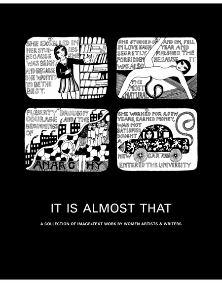
of It Is Almost That, which made me realize weve not talked about your limited editions and Siglio ephemera. Could you give a quick description of the box and some other items?The It Is Almost That (Box) takes its cue from the Great Bear pamphlets published by Something Else Press in the 60s and 70s. I asked ten of the artists who contributed to the book to play within a very simple form: a folded and saddle-stitched booklet. There are ten in the set and they range from a broadside by Ann Hamilton thats a concordance of the word time from works by Joyce and Stein, a taxonomy of psychics from around the world (with pull out poster) by Susan Hiller, a set of found pages from the memoirs of Eleanora Antinova by Eleanor Antin, a treatise on nude film by Fiona Banner, the entire text of Alison Knowless A House of Dust, among other excellent things. This edition is quite different from some of the others which have simply been the book with a beautiful hand-pulled lithograph (Nancy Spero and Joe Brainard) or with an original work of art (Robert Seydel and Keith Waldrop). We also made a portfolio of maps on vellum for Everything Sings, and the newest limited edition is a series of authentic, unique Tantric paintings by an anonymous Rajasthani tantrika for Tantra Song. The aim, in all cases, is to make something exquisite that is not entirely out of reach for a normal human being. The starting price for each edition is always well-below what one might expect. As for the ephemera, its always freea little gift in the tradition of Wallace Bermans Semina that creates a different kind of space for artists to play. Once weve given away the entire edition, we make another. Were now on set #4 which includes a postcard by Alison Knowles, a set of aphorisms in glassine from Robert Seydels Flowers & Formulas (A rabbi is nearly a rabbit is my favorite), and a color booklet portrait of Roberts library by the artist Richard Kraft.ARTBOOK: Well, it sounds like youre extremely busy: we should bring this interview to a close! But before we do, can you give us a preview of forthcoming projects?LISA: Next year is (perhaps as usual) extremely eclectic with work by Sophie Calle, Jess, and a young book artist/writer Amaranth Borsuk and the computer programmer/designer Brad Bouse. As I mentioned earlier, Ill be publishing The Address Book by Sophie Calle, a legendary project with quite an aura around it, living as it does at the epicenter of several layers of reality and fiction. In short, Calle found an address book on the street in Paris, and she copied all of the pages before sending it back to the unnamed owners address. She then embarked on a search to get to know this stranger through contacting the people listed, following him, in essence, through a map of his friends, family, and acquaintances. It was originally published in serial form over a month in the French newspaper Libération, with each days entry narrating an encounter, accompanied by images that seem to open an interior dimension to the story. Its a fragile, strangely intimate portrait of this man, whom she learns is named Pierre D., thats collaged through a multitude of disparate details from varying points of view. But its also a prism through which to see another aspect of Calles tracing desire and the elusivity of knowledge. The man, Pierre D., became enraged when he saw the pieces in Libération, so it was only after his death that Calle has published the piece in book form, first in France, and now, with Siglio, in English. Many people may know about the work from its plot-shifting appearance in Leviathan by Paul Auster in which the character Maria Turner is based on Calle, or from its twinned appearance in Calles Double-Game. Now, like her Suite Venitienne or Exquisite Pain, the work will stand on its own in a very intimate book form.Borsuk and Bouses book Between Page + Screen plays with desire and perception in a completely different way. Here its literally embodied in the space between the book page and the computer screen. They take an almost ecstatic pleasure in language, in playing with anagrams and etymology, and the epistolary banter between lovers P and S is rife with innuendo, sonic and historical affinities between words, and a loving attention to the shape and form of letters and language. But the book has no words! It is a series of graphic black and white markers (much more pleasing to the eye than barcodes or QR codes) that must be seen by the readers computer webcam. And then words spring alive from the pages of the book the reader holds in her hands. They shape-shift and mutate. And they are connected to the readers own movement, as if the words are little creatures that can be held but breathe quite on their own. I know its hard to imagine without seeing it, but is in fact quite simple. Theres an interview with Amaranth with a video of how the book and screen work together, but the actual experience cannot be replicated. (On their website, you can print a marker and try it out.) The book on its own will be a simple, beautiful object--but inscrutable. And thats got its own very interesting metaphoric resonance. There are many reasons I love this project, but if I had to cite two Id say, first, that it mines--with wit and a big dose of playfulness--the creative potential in two forms, digital and print, that people often see not only as mutually exclusive (if not outright competitive) but also as transparent containers to deliver information. Between Page & Screen revels in both forms and in what only a real relationship between them can generate. And it gives a glimpse of the possible future of the book. The other--and this hews also very close to my editorial vision for Siglio--is that it dives into the in between, a space, a quality, a state of mind, a means of perception that every other artist and writer Ive published also plumbs with the most interesting results. And then one last thing: I feel as if Im channeling Something Else Press and Dick Higgins, publishing a work that just behaves differently, unexpectedly, and has a great deal of fun doing it.And finally: Jess. Ive been wanting to do this book since I started Siglio and people have been asking me almost as long if Id publish a book of work by Jess. I knew I wanted to start with the entire set of Tricky Cad works and spin outward, but outward into Jesss oeuvre is an enormous and complex undertaking. I was very lucky that Michael Duncan (who curated Semina Culture and is currently working on a Jess-Robert Duncan show) came to me proposing a book. Were still deciding whats in and whats out, but whatever we choose, the emphasis is on legibility and comprehensiveness. I have no doubt it will be something extraordinary for the Jess aficionado as well as for the neophyte. This is the one people have been waiting for.
 Siglio
Pbk, 6 x 8.5 in. / 152 pgs / 91 color / 35 b&w.
| |
|


